
This modest demo of animations began in photoshop sketching up
frame-by-frame, intending to finish up with simple looping gifs, then anyway done some
extra motion in AfterEffects. Had no plan, odd things just happen!
Juggle Trumpet Udders
Rocket5G
Scene1 roughcut with audio
Its launch day for the 5G-rocket to put a satalite in orbit
This animation is something of a side-project I'm developing between illustrating jobs which are scarcer than ever these days. No thanks to lockdown my animating skills have exponentiated (is that a word?) to a competitive level in such a short time, the workflow focusses on Photoshop's own Video-Timeline panel with AfterEffects for finessing/tweaking enhancements. I trust it will amuse you and retain my contact details leading to an illustration commission, perhaps even an animation, I'm ready and happy to discuss your ideas!
In the meantime my cunning plan is to produce episodicly narrative bits of such comedic conspiracies not excluding extraterrestrial reptilian high priests of the new world order (circa Elon Musk, David Icke, et al) and not to mention the inhabitants of 'The Meat.' Anyway nuf said, much to do!
Subscribe to my news items for the next bits (as they occure to me)!
Subscribe to my news items for the next bits (as they occure to me)!
Lifesaver Screensaver
Been sometime since attending to my blogging what with that pandemic and little illustration work coming in so I decided to become an Animator, as you do, and to get in the mood, I made this Spiral and signed up to Vimeo (just because their player's preferable over Youtube's). Some great stuff coming soon.
.
Crypt Roundup
Mucking about in adobe's AfterEffects and Audition (not to mention photoshop and illustrator) since the newyear. It's now Mad March and the Daffs are up, and am done with cabin fever. Here's the results:
Two Animation Shorts
Stoneheads (sketches from this blog's header) bopping along timed near as damn it to Rocking duck by Johnny and The Hurricanes -
Reckon am done with self motivated ideas for now, better you commission me to illustrate your next big thing, chat me up before Mad March turns to April and I go chain my face to some railings :)
Gifs 4 squares
Random animated gifs
I'm playing with photoshop's Frames animator thing to establish a workflow  |  |
 |  |
What better way to show them
off!
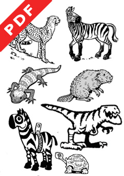
The PDFs Crypt
Open a pdf doc!..
Displaying a variety of illustration and graphic styles I do, some reflect the particular client's expectations, some bread'n'butter work and some, well, let's say Whatever floats y'boat stylewise.
 |  |
 |  |
 |  |
 |  |
 |  |
Frog Story
My illustrated retelling of the classic joke guaranteed to put kids from ages 3 to 103 into a total giggle fit when you tell it like the Wide Mouth Frog tells it. Click the image pops out the full monty as a pdf doc! -
-

Utales invited me to create on their ebook platform way back in 2010 (now defunct).
Writing and Illustrating took me about 5 weeks. I uploaded the artwork and formatted the words and font - which layout was rather limited back then. Anyway here's a few of my favourite spreads -


Runner Up again!
My design for The Warren's 2020 festival brochure -

Their full Brief here but in short they wanted something bold, colourful that
conveys the festy's spirit, and also include a depiction of their entrance signage. So I consulted that internet for inspiration to come up with the artwork. Here's some close-ups -


It's vector art with an overlay pixel-image of grit-texture manipulated so looks blockprinted in a subtle way, well that's the effect I was aiming for.
Also made a Local-Map intended for their inside back page. Though wasn't part of the Brief, was anyway the opportunity to show-off me skills -

The Map started life as screengrabbed google-map sections stitched together in photoshop for use as template for tracing over streets in adobe's Illustrator program, then brought that back into ph' for texturing-up and skewing the angle and adding the venue's location as indicated by their bunny logo popping out of its burrow!

Turnaround time was 2 weeks for both pics - as I only sighted their tweet announcing the call for submissions prior to deadline then. Well, my presentation pdf was their Runner-Up! Not for the first time, I was their runner-up for the commission last year too! which is Nice but adds up to 1600 fictional quid abducted by aliens. There y'go.
----------------------
Other news
I've bolstered my Wiredsussex Profile since they revamped their platform so please check me out there!
Human Cannonball Freak
Rebrand callout answered with my proposal for the Brighton Fringe Festival brochure cover. The Brief's objectives called for a design to include the theme Dive In and a 12 colour-code to distinguish the 12 types of venue/page-sections, and a flourish added to existing title logo, and that it must be all vector artwork -


I didn't get the callback I was banking on but hey maybe the marketing team might just pickup on my layout and well, in any case will have to wait till January's campaign reveal for my warm fuzzy feeling.
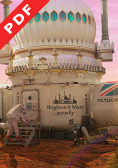
More recently, just last week in fact, I submitted this alternative film poster, see in context here with comments which makes for some interesting conversation about artistic license.

Anyway was the needed motivation to sort out me photoshop brushes. Still it needs some atmospheric fog and the guard on the left needs a ground shadow, and maybe drop in a UFO, dunno, I haven't seen the movie. Maybe I should, Bruce Dern plays the Icecream vanman. Oh yeah!

I didn't get the callback I was banking on but hey maybe the marketing team might just pickup on my layout and well, in any case will have to wait till January's campaign reveal for my warm fuzzy feeling.
- - - - - - - - - - - - - - - - - - - - - - - - - - - - - - - - -
More recently, just last week in fact, I submitted this alternative film poster, see in context here with comments which makes for some interesting conversation about artistic license.
Anyway was the needed motivation to sort out me photoshop brushes. Still it needs some atmospheric fog and the guard on the left needs a ground shadow, and maybe drop in a UFO, dunno, I haven't seen the movie. Maybe I should, Bruce Dern plays the Icecream vanman. Oh yeah!
Film Poster
Here's a thing!
If you fancy the idea of designing film posters for prizes then check my tweet -
My tweet refers to FREAKS (a Horror/Scifi/Mystery flick premiering now at London's FrightFest) and before you ask, no i haven't a clue what this movie's about or whether 'not-of-this-Earth' Aliens feature at all, a bit of a mystery to everyone else too apparently, Freaks too I shouldn't wonder.
If you fancy the idea of designing film posters for prizes then check my tweet -
Hi @PosterSpy , Here's my #FreaksPosterArt .. my 1st ever entry and currently a WIP so designing while Sept'18 midnight deadline approaches.— Doodling Jim (@DoodlingJim) August 24, 2019
. #FreaksPosterSpy #posterdesign @adamstein @zachlipovsky pic.twitter.com/629sTB1iQS
My tweet refers to FREAKS (a Horror/Scifi/Mystery flick premiering now at London's FrightFest) and before you ask, no i haven't a clue what this movie's about or whether 'not-of-this-Earth' Aliens feature at all, a bit of a mystery to everyone else too apparently, Freaks too I shouldn't wonder.
Subscribe to:
Posts (Atom)


